Tired of Feeling Blue; Bright Colors Enliven Commercial Spaces
Beiges and dull blues are a thing of the past. Interior designers are incorporating a richer color palette in commercial spaces these days. Brightly colored accent walls, carpeting, and furniture add vitality to any commercial space including corporate offices, hotel lobbies, waiting rooms, and restaurants. In 2014, look for teal, chartreuse, violet and fuchsia to appear in textile fabrics, carpet tiles, accent furniture and more.
White and black color patterns continue to be favored as well. According to Sherwin-Williams Color Marketing & Design experts, these traditional colors take on a more modern and sophisticated role when paired with brighter, more vibrant hues.1 The lobby and front desk area of Le Meridien Dallas by the Galleria is a perfect example (see photo above).
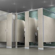
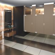
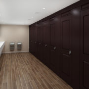
Not ready for fuchsia yet? Shades of gray, as well as colors with gray undertones seem to be the new trend. In fact, it looks like gray just might be the new age beige. Just be sure to use warm gray hues that are closer to taupe. Try our Nickel (Metallic Series), Storm (Mosaic Series) or Shale (Designer Series) toilet partitions in your next bathroom project.


